


Across all kinds of projects, using a programming language called Python includes several sorts of libraries. Similarly, Python includes a variety of packages for data visualization so that users may comprehend the dataset in great detail and appropriately analyze it.
There are different charts for data visualization, which include bar charts, scatterplots, line charts, maps and box charts etc. These libraries are so widely used because they easily and quickly offer an interface and data visualization capabilities in one spot, enabling data analysts and data scientists to easily build dashboards according to their specifications!
I'll explain the most popular data visualization techniques in this article and walk you through how to plot them.
The following well-known Python data visualization libraries were indeed discussed in this article:
Matplotlib
Plotly
Seaborn
Bokeh
Folium
Let's make use of Numpy to generate a constant array of numbers.
NumPy is a very strong Python library that is commonly used in Data Explanatory Analysis (for a better understanding of data), Data Manipulation, and Data Cleaning.
Let's Get Started..........
Matplotlib
The most popular base Python package for data visualization is called Matplotlib. It is frequently used by data scientists ranging from beginners to specialists. If you've ever used MATLAB, you'll see that matplotlib shares certain features with it. It is a complete Python package for building static, animated, and interactive visualizations.
You can create practically any type of 1D or 2D chart using matplotlib. There are many types of charts, such as line charts, bar charts, histograms, heat maps, box plots, scatter plots, contours, and so on. It also supports 3D chart via its extension toolkit mplot3d, it takes complete control over plot modification, including line styles, typeface, and axes.
However, because matplotlib is very customizable, it is difficult and inefficient to learn and use in a short period.
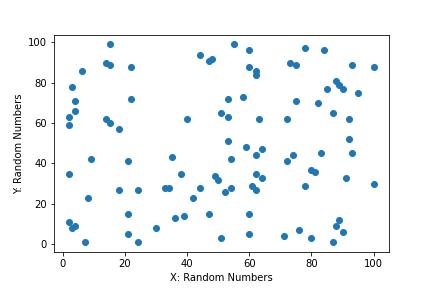
import matplotlib.pyplot as plt
import numpy as np

np.random.seed(42)
random_x = np.random.randint(1, 101, 100)
random_y = np.random.randint(1, 101, 100)

# Now let's plot our graph with Matplotlib...

plt.plot(random_x,random_y,'o')
plt.xlabel("X: Random Numbers")
plt.ylabel("Y: Random Numbers")
plt.show()
output:
Plotly
Plotly is an open-source library for general data visualization focused on interactive visualizations. Plotly is a web-based data visualization, which is built on top of the Plotly JavaScript library.
Plotly has libraries for JavaScript, Python, React, and R.
The most popular library is the Python library. As a general data visualization library, it focuses on interactive visualization. Plotly library creates an interactive plot as .html files, this visualization is incompatible with modifying the data source.
You would need to re-run the .py script and it regenerates the .html file to see any updates.
Plotly supports over 40 different chart types, including histograms, pie charts, scatter plots, line charts, bar charts, pie charts, box plots, multiple axes, sparklines, dendrograms, and 3D charts. Plotly also provides both online and offline modes for data visualization.
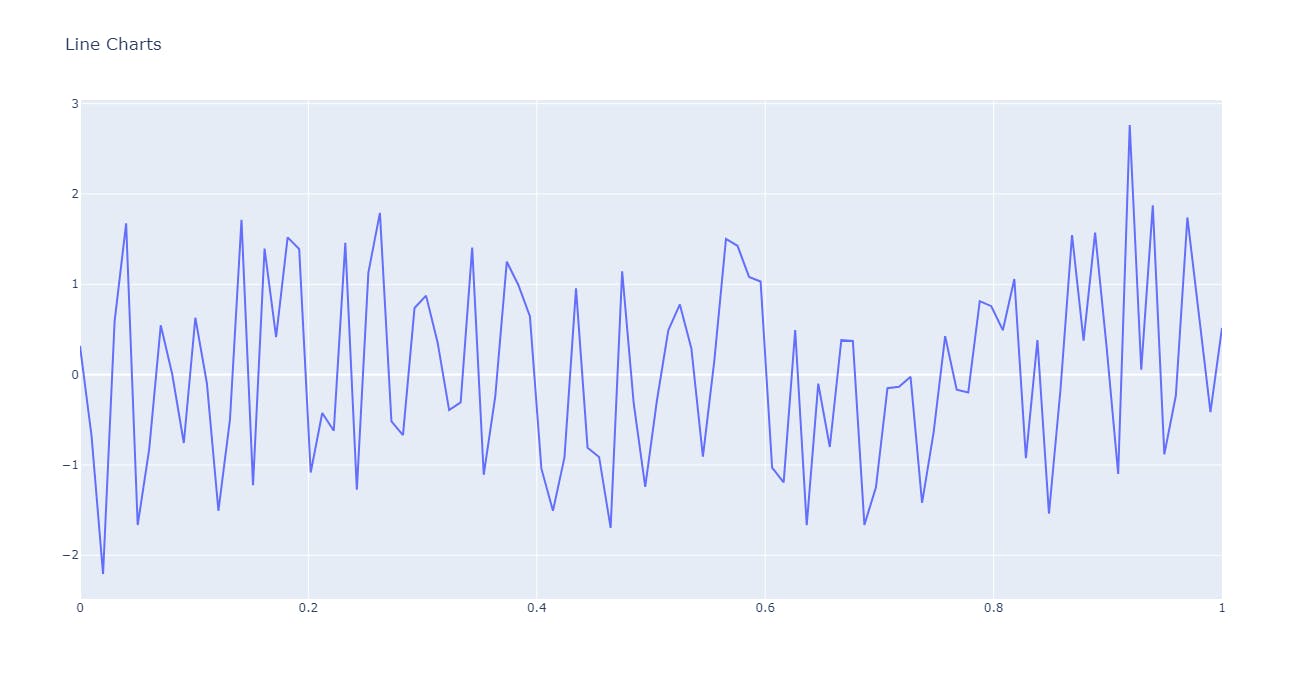
np.random.seed(72)
X = np.linspace(0, 1, 100)
Y = np.random.randn(100)
import plotly.offline as pyo
import plotly.graph_objects as go

line_chrt = go.Scatter(x = X, y = Y, mode = 'lines', name = 'Line Chart')
layout = go.Layout(title = 'Line Charts')

fig = go.Figure(data= line_chrt, layout= layout)
pyo.plot(fig)
output:
Seaborn

A Python module called Seaborn is used to create visualizations of statistical data. It is a higher-level library built on the foundation of matplotlib, as was previously indicated. Additionally, because of its strong integration with Numpy and Pandas data structures, it is simple to understand and implement.
There are several dataset-oriented graphing routines in Seaborn that work with data frames and arrays that include whole datasets. The relevant statistical aggregation and mapping operations are then carried out internally to produce the user-requested informative displays. It is a comprehensive interface for producing stunning and instructive statistical images, which are essential for studying and comprehending data.
Violin plots, histograms, pie charts, box charts, bar charts, scatterplots, etc. are some examples of Seaborn data visualizations. Additionally, it offers a variety of options for selecting colour schemes that highlight data patterns.
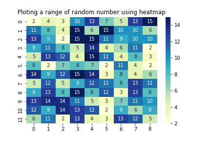
import seaborn as sns
data = np.random.randint(2,16, size= (12,9))
ax = sns.heatmap(data, annot=True, cmap='YlGnBu', fmt="d")
plt.title("Plotting a range of random number using heatmap",fontsize=12)
plt.savefig("heatmap visualization.png")
plt.show()
output:
Bokeh

Regardless of the size of the datasets, Bokeh is a data visualization framework that offers beautiful images with a high level of interaction. Bokeh is based on The Grammar of Graphics and is native to Python. Data visualization professionals may employ bokeh, which can be used in interactive online apps, HTML files, and outputs of JSON objects.
Real-time and streaming data are also supported by Bokeh.
Three degrees of bokeh can be utilized to build visualizations.
The first level focuses solely on swiftly producing data plots
The second level manages the plot's fundamental elements
The third level offers complete autonomy for plotting charts without any pre-determined defaults.
This library contains many tools for creating and plotting common charts including box plots, histograms, and bar graphs.
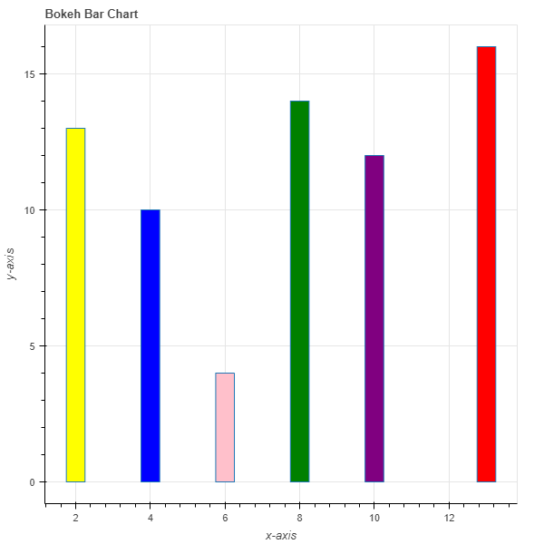
from bokeh.plotting import figure, output_file, show

x = [2, 6, 4, 8, 10, 13]
y = [13, 4, 10, 14, 12, 16]

graph = figure(title = "Bokeh Bar Chart")

graph.xaxis.axis_label = "x-axis"
graph.yaxis.axis_label = "y-axis"

colors = ["yellow", "pink", "blue", "green", "purple", "red"]

graph.vbar(x, top = y, fill_color = colors, width = 0.5)
output_file("Bar-Chart.html")
show(graph)
output:
Folium

Folium is a Python package that enables us to quickly construct maps and make any necessary adjustments or additions. With few lines of code, it is quick and simple to use while producing gorgeous graphical visuals within an instance. It allows for the coupling of data to a map for choropleth visualizations as well as the passing of rich vector, raster, and HTML visualizations as markers on the map.
The library supports custom tilesets with Mapbox or Cloudmade API keys and includes some built-in tilesets from OpenStreetMap, Mapbox, and Stamen. The overlays for GeoJSON, TopoJSON, Image, and Video are all supported by folium.
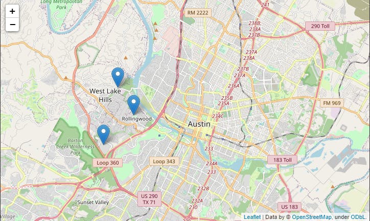
import folium

fm = folium.Map(location=[40.730610, -73.935242],
                zoom_start=12)

folium. Marker([40.706005, -74.008827],
                 tooltip='Wall Street').add_to(fm)

folium. Marker([40.748817, -73.985428],
                tooltip='Empire State Building').add_to(fm)

folium. Marker([40.689247, -74.044502],
                 tooltip='Statue of Liberty').add_to(fm)

fm
output:
Conclusion:
This article has gone into further detail about the many types of Python modules used for data visualization and a few lines of code. We also reviewed each library's many uses and purposes, as well as their distinct features, such as which library is used for what type of plotting and chart creation, and how we may get more accurate and rapid output visualization of our data collection.
Thank you for your time. 🥳🥳🥳